mcwg
Link to main MCWG Climate Change Resources site.
Mauna Loa CO2 data

The Mauna Loa observatory in Hawaii, 11,135ft above sea level, has been continuously collecting data related to climate change since the 1950s. (Image from Christopher Michel licensed under CC-BY 2.0 downloaded from flikr).
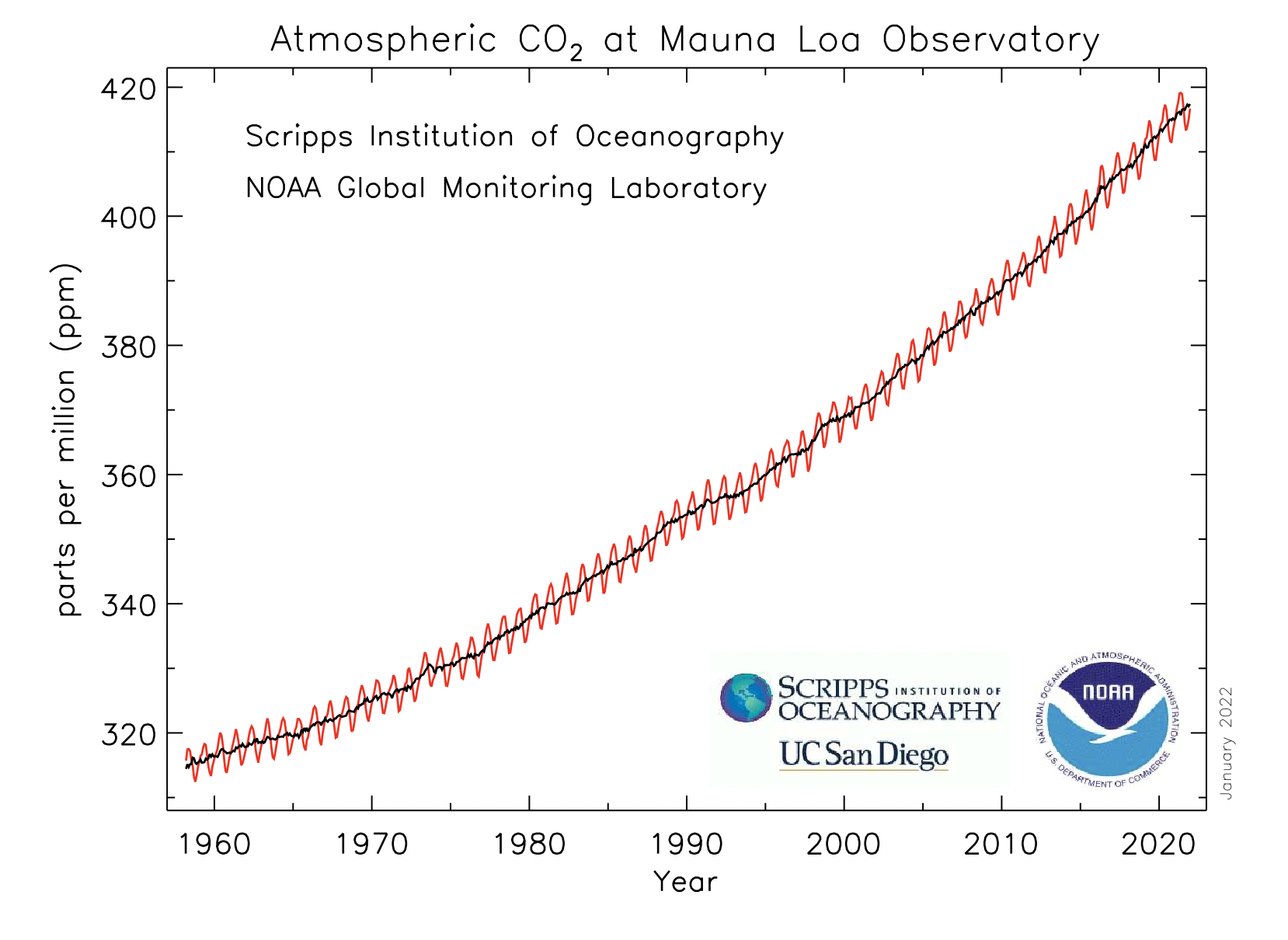
The graph below shows the monthly mean CO_2 concentration data from Mauna Loa. This is known as the Keeling Curve, named after Charles David Keeling who started the monitoring program. The Keeling Curve is the black curve in the image, which removes seasonal variation. (Image and data from NOAA)
Main interesting question about this data
Is the Keeling curve linear or exponential? How can we tell?
What students will find:
Keeling curve is not linear
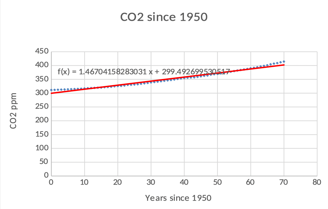
- Graph below: Linear Fit
- Linear function does not fit well
- Slope is too large in 1950 and too small in 2020
- Interpret slope: An increase of 1.47 ppm per year
- Interpret intercept: Projected CO2 in 1950 was 299.34 ppm
Keeling curve is not exponential
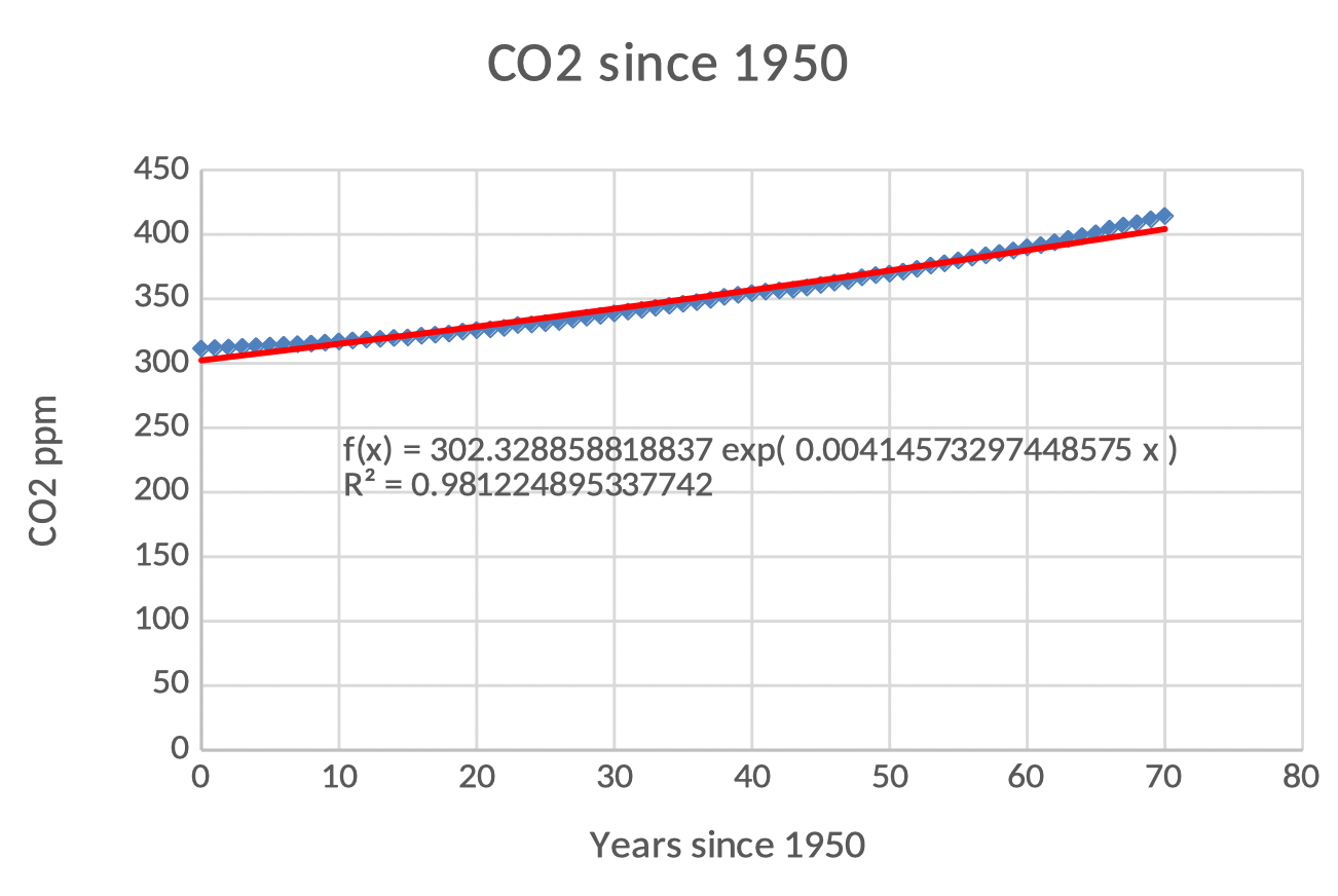
- Exponential function also does not fit well
- Climbing slower in 1950 and faster in 2020
- Seems to be growing faster than an exponential!
- Interpret intercept: Projected CO2 in 1950 was 297.82 ppm
- Interpret growth rate: Increases continuously at 0.41% ppm/yr
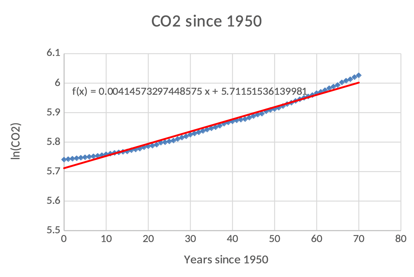
Log plot or plot of ln(CO_2) to see the “super exponential” growth
The fact that the plot of ln(CO_2) is still concave up (plot below) means that the data cannot be fit well by an exponential (if f(t) is exponential, then the plot of ln(f(t)) is a line).
In the graph below the slope of the line is the continuous growth rate: 0.41% ppm/yr.
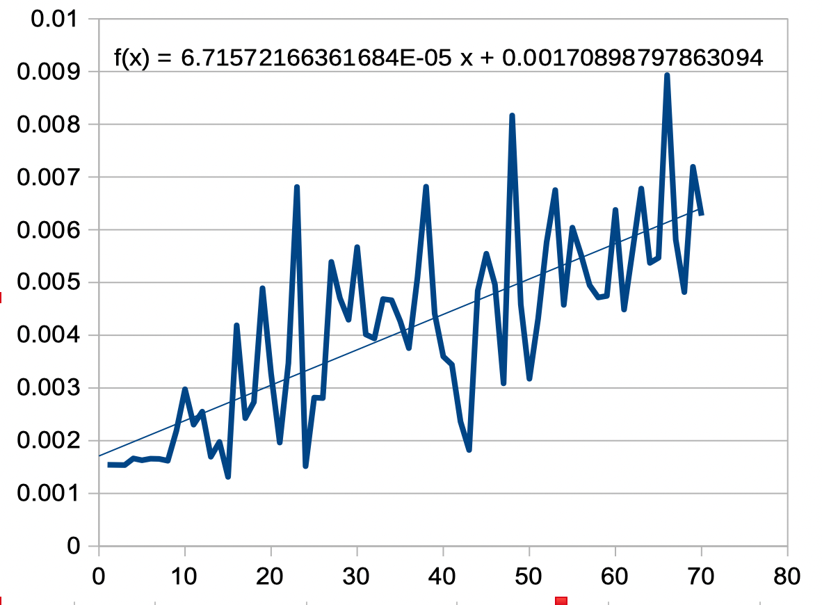
It is not unreasonable to assume that growth factor, instead of constant, is growing linearly
The model in the plot below is given by P_0(b+mt)^t=311(1.0017+0.0000341t)^t
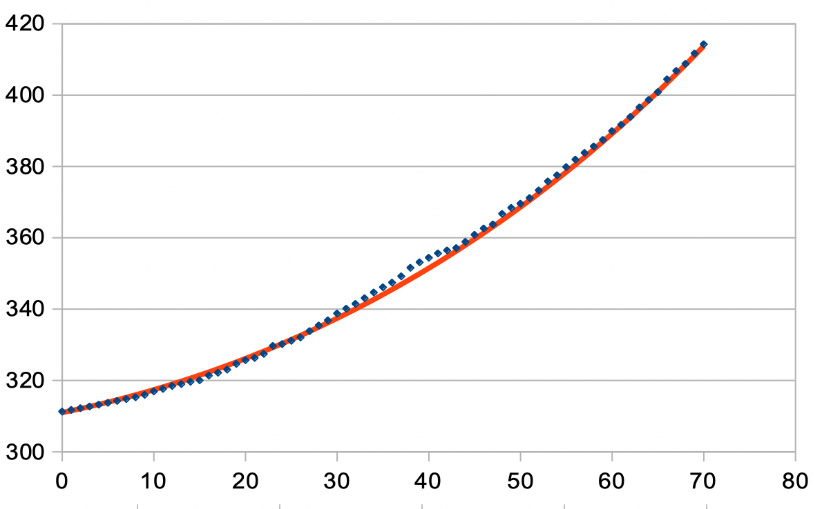
Finding this model is more involved. It requires plotting the growth factors between each year and looking for a trend line, then tweaking the parameters until a good fit is obtained. Plot of growth factors is shown below:
There are other non super-exponential models
One “almost exponential” one is given by: g(t)= C+Ba^t=267.277+48.703(1.01823)^t
A quadratic one is given by: h(t)=0.013t^2+0.8055t+315.5219
Getting the data for your students
Students can get the data, or you can give it to them:
- Data is freely available at the NOAA site.
- You can download the spreadsheet file we created with relevant plots. You can share only the data with students, and have them make the plots.
Teaching Resources
- Sample problem statements and solutions to use in class.
- PPT slides for teachers with details about this activity.
More Climate Change teaching resources
See our main MCWG climate change site.
Subscribe for news
If you would like to hear of any updates to this page or resources we create about this, please fill out the form in the following Google Form.
Contact Us
Write to mcwg.contact@gmail.com. Please let us know how you found this site.